This page contains tips, things I like or find of interest, opinions etc.
One such opinion: If I see an AI-generated image on your website/article/whatever, I'll close the tab. Please stop adding stuff that contributes nothing. I almost miss the stock photos of people grabbing the soldering iron by the wrong end.
UI Design and Accesibility
Screen Real State
These days we have big screens everywhere and yet we insist in using small fonts and buttons.
On Ticket machines, ATMs, etc: There is a space between the tactile screen and the display. If you look from an angle, there is parallax error. If you insist in making the buttons 10 x 10 mm (in spite of having lots of screen real state), people are going to miss and hit the wrong one.
Interfaces have to be clear, functional, easy to use, not "pretty" according to some arbitrary standards. On one hand, designers add high contrast modes for the color blind, audio guidance etc. But keep making text and buttons small, and menus complicated. If you need a person to tell you how to buy a ticket, the interface is wrong.
How much screen real state do you want to waste?
Settings Dialogs
Certain programs have settings dialogs where if you hover your mouse over a value, you can change that value with the scroll wheel. It may be useful sometimes, but it is really easy to change something without noticing it, and that combined with having to scroll through a tall window is a recipe for disaster. At least make users click on the value before it can be modified, or remove this feature alltogether.
Multiple Ways to Achieve the Same Thing
I have seen very simple programs with very limited functionality that place the very same five functions on several places on the screen: icons on top ribbon, same icons on left ribbon, drop-down options in the menu bar...
On coding practices
General
Please, please, include at least a couple lines on top of each file explaining what it is and what it does. Bonus points if you include authorship/license. But this is secondary to the file's purpose. A high-level document with an overview of where everything is, is also very nice. It is hard enough to navigate a new code base, even if armed with grep and find.
HDLs
- Please follow some naming convention with active low signals, e.g., ending in "_n", and stick to it.
- When your "design intent" is that something happens when this OR that signal is active, use an OR operator. That is, even if !(a_n & b_n) is equivalent to (!a_n | !b_n) they do not convey the same meaning to the reader.
On technical illustration
- If you draw a sine-wave with a couple Bezier curves or similar such that the slope at zero is infinite, thou shalt be fired. I have seen this in too many textbooks.
Random tips
These are some reminders, mainly for my own use.
Some I-wish-I-knew-before things:
On some PDF readers, Alt+left arrow takes you back to the last view (e.g., to go back after clicking on an hyperlink).
On MS Paint, the Shift key makes lines at 45º increments, ovals circular and rectangles square.
Ctrl+L clears a terminal. No need to write "clear".
MS Word
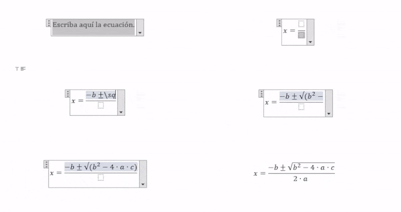
Equations in MS Word without leaving the keyboard:
Here are some examples of what can be done in MS Word. Equation editor can be opened with the Alt+= shortcut, and just type your equation in. No more fiddling with equation menus looking for your symbol.
A list of commands can be found in File>Options>Proofing>Auto-correct options>Math Auto-Correct
(In Spanish: Archivo>Opciones>Revisión>Autocorrección>Autocorrección Automática). You can even add your own, for example, I have set it up to replace "\exp" by "·10^" for writing faster in scientific notation. Math Auto-Correct can be enabled outside of the equation editor, so if you write "\alpha" in your regular text, it gets replaced by "α"
Equations can be placed in-line, which comes in handy for simple subscripts and superscripts.
Miscelanea
Please learn how to use titles, indexes, figure captions and automatic figure references (So that numbers update automatically if you add or remove figures). It is really easy.
I personally do not like Word's built in citation manager. I do strongly recommend Zotero (stand-alone program with a Word plugin).
(Before you say "Use LaTex", I do use LaTex, but Word has its place)
MS Excel
You can assign meaningful names to your cells, and use them in equations, instead of the alphanumeric codes. These names also appear as suggestions when you are writing your formulas. This is much clearer and less error prone.
Inkscape
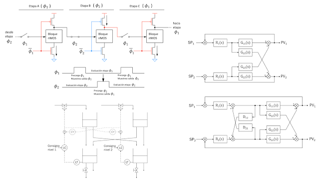
I really like Inkscape for technical illustration. Just knowing how to use the draw tool and a snap grid can do wonders. Electrical schematics, timing diagrams, UML diagrams ... everything can be done with just one program.

Want to change the color of a trace on a graph you have in PDF? Import it in Inkscape, two clicks, done.
Want to distribute components inside an enclosure, or furniture in a room? Draw a couple rectangles scaled to your dimensions and move them around until happy with the layout.
You can draw a transistor, a logic gate, an inductor..., select it, group the elements that make it up and you can now use it as a component.
And now you have nice vector figures to include in your report, and that you can edit at any time.
LaTeX
Google scholar is great to get BibTeX citations:
MISC
How to paste Inkscape SVGs into Microsoft Word preserving arrow formating:
1. Draw your figure on Inkscape
2. Export said figure to PDF
3. Import PDF back to Inkscape
4. Copy and paste from Inkscape to Word
5. Profit
This has something to do with svg standard and marker settings (arrows for example).
Note: It helps to export figures to PDF individually, because it may mix them together (as in joining text boxes for example) when you import them back.
Note 2: https://superuser.com/questions/1709965/pdf-export-from-word-changes-line-width-of-thin-lines-in-embedded-svg
From Microsoft PPT to Microsoft Word, so figures can be scaled without moving things around:
Copy from PPT, paste on Inkscape. Paste back to Word from Inkscape.
Stroke to path helps with getting rid of some fonts that may misbehave.
Kicad Libraries
On Kicad 7.0
Symbol editor > Create new libray > Project: Creates kicad_sym file
-Import/create symbols in symbol editor
Footprint editor > Create new library > Project: Creates .pretty folder
-Import/create footprints in footprint editor and save them to library
On teaching: Opinion page of a mildly disgruntled university student
Teaching materials
- Cite sources on slides. I do not want to spend my time figuring out whose's slides you ripped off or from which book you took that particular figure. Whatever you copied is likely incomplete or out of proper context, and I may want to take a look at the original thing. Then there's of course giving credit to the original source.
- If you do not like something on your slides, do not apologize for it, change it!
- Slides with white background and dark text / figures are more easily printed. Please do away with "gradient" backgrounds and the like.
- Organized slides make the material easier to follow. Number your lessons and headings, use different styles for headings and sub-headings etc. It is hard to piece this together when you do not yet understand the topic.
- Animations can be great on certain ocassions, just make sure something intelligible results when you export to PDF!
Technical language
- Especially for those for whom english is not their native tongue, please use the appropriate technical jargon for the subject you are teaching. A couple mistakes or mispronuntiations here and there do not matter as long as you get your point across, yet getting jargon right is a must on technical courses.
Examples:
- voltage fall drop
- charge porters carriers
- jump step response
- industry tendencies trends
- A pronuntiation pet peeve: Aliasing is pronounced ay-li-ah-sing not a-lay-a-sing.
Evaluation
- Feedback, and timely feedback that is, is invaluable. Students tend to want more that a number three weeks after the final exam. I want to know how I did on that last report so I don't make the same mistakes again.
Course organization
- Most courses I waded through suffered from an increasing workload as the semester progressed. While it is true that some practical material cannot be tackled before some theory classes, some homework and deliverables can be assigned earlier.


Comments
Post a Comment